Physical Address
3260 College Rd, Fairbanks, Alaska

By Derek V. Mackown | IT Technician & Display Hardware Specialist
Color calibration done correctly is not a settings change. It’s a session, a structured sequence of steps that must happen in a specific order because each one builds on the accuracy established by the previous one. Do them out of order and you’re correcting errors with other errors. The result looks better than the starting point but isn’t accurate. You won’t know the difference until a client prints your file and the colors are wrong.
I’ve calibrated monitors for print studios, commercial photographers, motion graphics houses, and color grading suites. The workflow I use on a $4,000 reference monitor is the same workflow I use on a $400 IPS panel, the tools differ in precision, but the sequence doesn’t change. What I’m going to walk through here is that sequence, the reasoning behind every stage, and the specific targets you’re aiming for at each step.
Before we start: if you’re designing for screen only output, social media, UI/UX, web color calibration still matters, but the stakes are lower and some stages are optional. If any of your work goes to print, every stage in this guide is mandatory. I’ll flag which is which as we go.
Table of Contents
ToggleCalibration without a colorimeter is guesswork. The human eye adapts to what it sees, it’s the worst possible instrument for measuring absolute color accuracy because it compensates for errors in real time and tells you everything looks fine. A colorimeter measures what the screen actually outputs and compares it to what it should output. Without one, you’re adjusting until it looks right to you, which is not the same as being right.
Colorimeter options by budget and use case:
| Device | Price Range | Best For |
|---|---|---|
| X-Rite i1Display Pro Plus | $250 – $280 | Professional print and photography work – the industry standard |
| Datacolor Spyder X Pro | $150 – $180 | Professional use, excellent software, reliable results |
| Datacolor Spyder X | $100 – $130 | Serious hobbyist and semi-professional work |
| X-Rite ColorMunki Smile | $75 – $90 | Entry level – adequate for screen-only work, limited for print |
| Calibrite ColorChecker Display | $160 – $190 | Strong alternative to i1Display, same X-Rite sensor heritage |
Every colorimeter above ships with calibration software. The software matters as much as the hardware, the calibration workflow, the profile quality, and the re-calibration scheduling features differ meaningfully between them. I’ll reference i1Profiler (X-Rite) and Datacolor Spyder X software by name in the relevant stages.
Software-only calibration tools — Windows’ built-in Display Color Calibration utility, Mac’s Display Calibrator Assistant, produce a gamma adjustment curve, not a true ICC profile. They’re better than nothing for basic screen work but will not produce print-accurate results. Use them only if a colorimeter isn’t an option.
What your monitor needs to support:
Not every monitor is worth calibrating for professional color work. Before spending time on the calibration process, confirm your monitor meets a minimum specification threshold:
If your monitor falls below this threshold, calibration will improve it, but it cannot compensate for a narrow-gamut or low-bit-depth panel’s structural limitations.
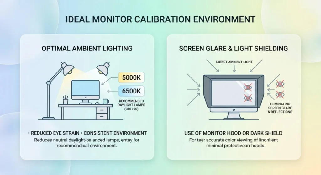
Every professional calibration session starts with the room, not the display. This stage is skipped by almost everyone who reads calibration guides online. It is not optional for accurate work.
Why the room matters: Your visual system doesn’t evaluate the monitor in isolation. It evaluates it relative to everything else in your field of view, the ambient light color temperature, the brightness of the walls, the reflections on the screen surface. If your room is lit with warm tungsten bulbs at 2700K and your monitor is calibrated to D65 (6500K), your brain will shift its white point adaptation toward the warmer ambient and you’ll overcorrect the monitor toward blue to compensate. The calibration will be wrong in that room and right everywhere else, which is the worst possible outcome because you’ll consistently export work that looks correct to you and wrong to everyone else.
Establish a controlled viewing environment:
Ambient light should be neutral daylight or daylight balanced artificial lighting. The target color temperature for graphic design work is D50 (5000K) for print work, or D65 (6500K) for screen-centric work. These targets match the standard illuminants used by the print industry and the sRGB specification respectively.
Eliminate direct light sources that fall on the screen surface. Monitor glare from a window or overhead light introduces reflected light with a different color temperature than the screen itself, causing your eye to see a composite color that isn’t representative of the display’s output.
The ambient light level should be moderate to dim – approximately 32 – 64 lux for color-critical work. Brightly lit offices with overhead fluorescents are not ideal environments for color-critical work. If you cannot change the room, hood your monitor with a display calibration hood (available from X-Rite and Datacolor). These fabric hoods attach to the front of the monitor and block ambient light from reaching the screen surface.
This stage is complete when: ambient light is consistent, neutral in color temperature, and not falling directly on the screen surface. If your environment changes significantly, you move to a different room, the season changes and the window light shifts, you switch from daylight to evening artificial lighting, the calibration result becomes partially invalid. Professional studios maintain controlled lighting conditions specifically to avoid this.
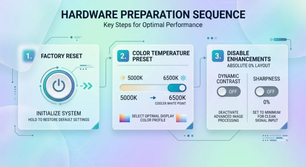
Before your colorimeter touches the screen, the monitor’s OSD settings must be configured correctly. Profiling a monitor with wrong hardware settings bakes those errors into the ICC profile, the profile will compensate for them, but it will do so by applying a correction curve that reduces the display’s available bit depth and color precision.
The correct approach: get the hardware as close to the target as possible first, then profile what remains.
Reset the monitor to factory defaults. OSD → System → Factory Reset (label varies by manufacturer). This clears any previous calibration curves, custom color settings, and gamma presets that might have been applied. Start from a known baseline.
Set the color temperature preset to the closest hardware option to your target:
For print work (D50 target): select the monitor’s 5000K preset if available. If not, select 5500K or Neutral, the colorimeter software will handle the remaining correction.
For screen/digital work (D65 target): select 6500K preset. Most monitors labeled “sRGB mode” are targeting D65, this preset is often the most accurate starting point.
Do not use Warm, Cool, Custom, or User defined color temperature presets for calibration starting points unless you have a specific reason. These presets apply manufacturer-defined adjustments that are inconsistent across firmware versions.
Disable all image enhancement features:
Every monitor ships with features that make the image look impressive in a showroom and corrupt accurate color reproduction in a studio. Disable all of the following before proceeding:
| Feature Category | Common Label Names | Action |
|---|---|---|
| Dynamic contrast | DCR, Smart Contrast, ASCR, Mega Contrast | Disable |
| Sharpness enhancement | Clarity, Super Sharpness, Vivid Pixel | Set to 0 |
| Color vibrancy | Digital Vibrance, Saturation Boost, Color Gamut Enhanced | Disable / set to 50 |
| Noise reduction | ANR, DNR, MPCTF | Disable |
| Auto brightness | CABC, ECO, Intelligent Brightness | Disable |
| Gamma presets | Film, Photo, User | Set to 2.2 |
Set brightness manually — do not leave it on auto. Target luminance for calibration is 80 – 120 nits for typical studio environments. Run your colorimeter software’s brightness guide, which will show a real-time luminance reading as you adjust the OSD brightness slider. If your room is darker, target 80 nits. If brighter, 100 – 120 nits. Using the monitor at a calibrated 100 nits and then immediately ramping it to 300 nits for casual use defeats the calibration, if you need different brightness for different tasks, keep a note of the OSD brightness setting that corresponds to your calibration target.
This stage is complete when: factory reset is applied, color temperature preset selected, all image enhancement features disabled, and brightness set to within 5 nits of your luminance target as confirmed by the colorimeter’s luminance reading mode.
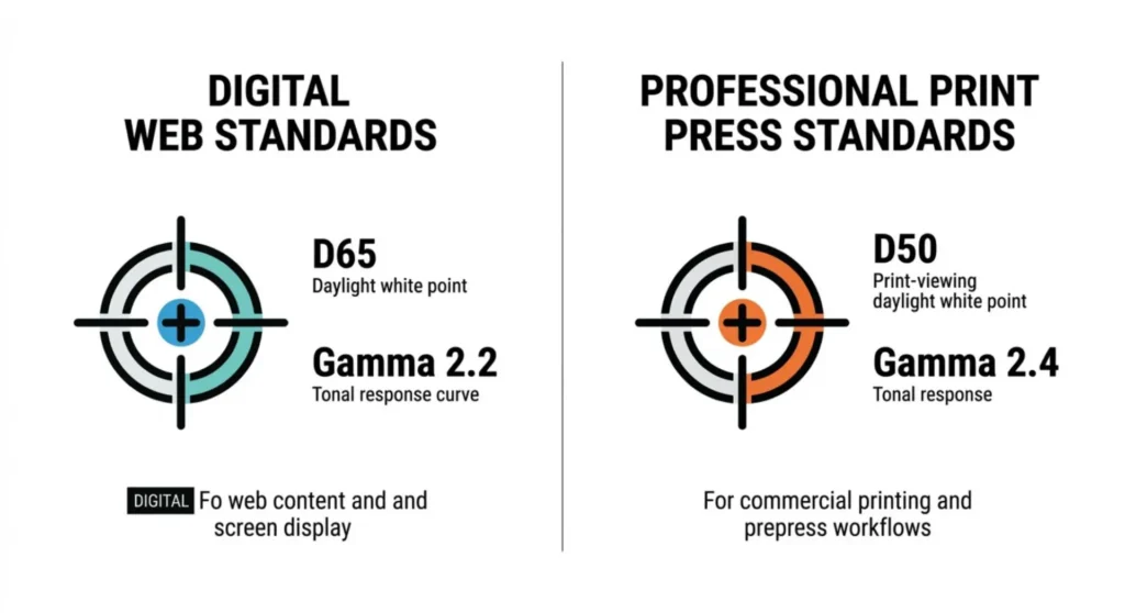
Before running the profiling session, you need to know what values you’re calibrating toward. These aren’t preferences, they’re industry standards with specific numeric definitions.
White point: The color of “white” on your display, expressed as a correlated color temperature or a CIE xy coordinate.
Gamma: The tone response curve of the display, how luminance output maps to digital input values.
Target luminance: 80 – 120 nits as established in Stage 2. The exact value within that range depends on your environment. More important than hitting a specific number is being consistent, always calibrating to the same luminance level in the same environment.
Black level: The luminance of a fully black display. Follows automatically from your brightness/contrast OSD settings, do not adjust OSD contrast (not brightness) during profiling unless your colorimeter software specifically instructs it. Touching contrast inappropriately clips shadow detail in the ICC profile.
Write these targets down before you open the calibration software. When the software asks you to select targets, enter them from your notes, not from software defaults, which vary by software version and may not match your specific workflow requirements.
With environment established, hardware configured, and targets defined, the colorimeter session itself is the most mechanical part of the process. The software guides it; your job is to follow it correctly and not interrupt it.
Warm up the monitor for at least 30 minutes before profiling. LCD backlights and OLED panels both shift their color characteristics as they reach operating temperature. A cold-start calibration drifts as the panel warms, you’ll have an accurate profile for the first hour that becomes inaccurate over the session. 30 minutes of normal use before profiling produces a stable baseline.
Attach the colorimeter to the center of the screen — not the top, not a corner. The center is where luminance is most uniform on most panels. Attach it to the glass surface with the provided counterweight or suction mount according to the device instructions. If your screen has a matte coating, this is more important than it sounds, the colorimeter optics need contact with the screen surface, not hovering above the texture.
i1Profiler workflow:
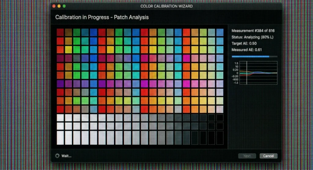
Open i1Profiler → Display → Profiling → select your colorimeter from the connected device dropdown → enter your targets (white point: D65 or D50, gamma: 2.2 or 2.4, luminance: your target nits) → select patch count. For professional work: use the large patch set (118+ patches minimum). A 46-patch quick profile is adequate for casual screen work; it is insufficient for print-critical or photography work where shadow and highlight accuracy matter.
Allow the session to run without interruption. Do not use the computer, change ambient light, or move near the monitor during profiling, vibration, changing ambient color, and screen interaction all introduce measurement error. Most sessions take 5 – 15 minutes depending on patch count.
Datacolor Spyder X Pro workflow:
Open Spyder X software → Calibrate → enter targets → select Full Calibration → follow the on-screen brightness guide to hit your luminance target using the OSD → run the measurement session. Spyder X Pro provides a ReCAL feature for fast re-calibration, use this for weekly maintenance calibrations after the initial full calibration establishes the baseline.
After the session: The software generates an ICC profile and, depending on your software, will ask whether to set it as the default profile for that display. Confirm yes. The profile is stored in your OS profile store and Windows or macOS applies it automatically to color-managed applications.
This stage is complete when: the ICC profile is generated, saved, and set as the active profile for your monitor. Verify in Windows: right-click desktop → Display settings → Advanced display → Display adapter properties → Color Management → check that your new profile appears and is set as default.
A calibration profile is only as good as your ability to verify it. This stage confirms the profile is working correctly in your actual design applications before you commit work to it.
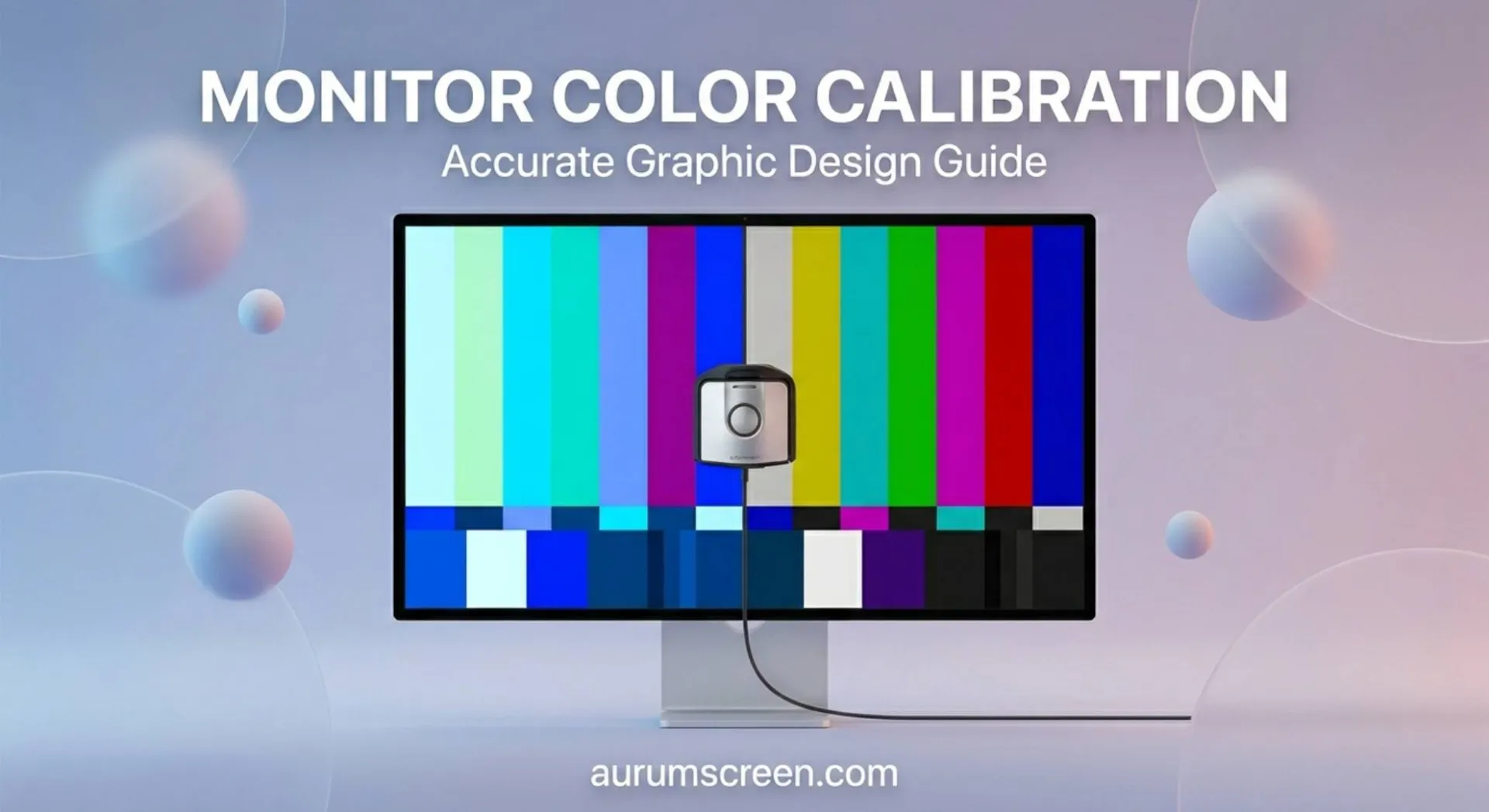
Open a known reference image. The X-Rite ColorChecker Digital SG target image (available as a free download from X-Rite’s website) contains standardized color patches with known colorimetric values. On a correctly calibrated and profiled display, the neutral grey patches should appear neutral and no color cast. The skin tone patches should look like natural skin tones under D50 or D65 illumination. The saturated color patches should appear vibrant but not fluorescent.
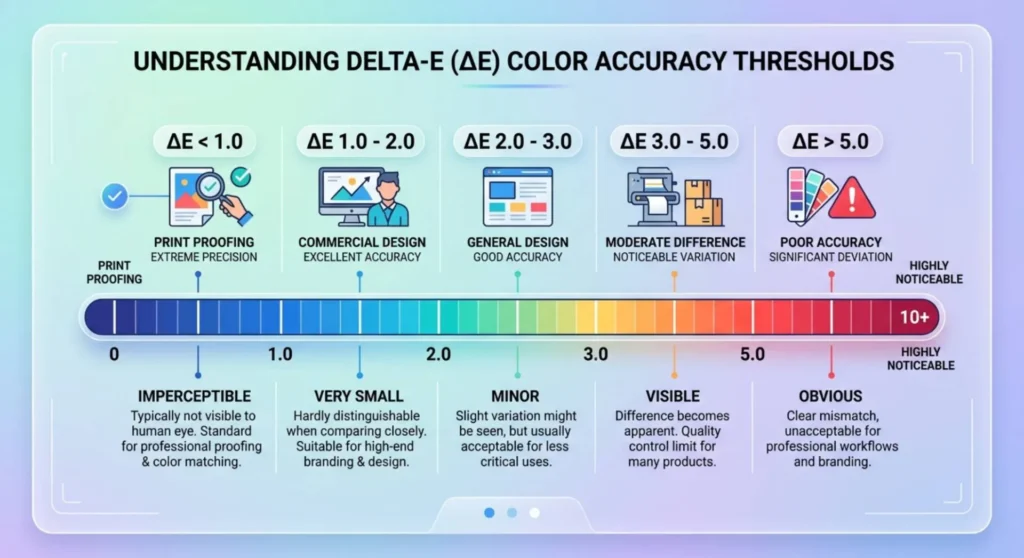
Run a validation measurement in your colorimeter software. Both i1Profiler and Spyder X Pro include validation modes that measure your display after profiling and report the ΔE (Delta-E) error, the measurable color difference between what the display should output and what it actually outputs after calibration.
ΔE targets by work type:
| ΔE Score | Assessment | Adequate For |
|---|---|---|
| ΔE < 1.0 | Imperceptible error | Print proofing, photography, broadcast mastering |
| ΔE 1.0 – 2.0 | Just perceptible | Professional design, commercial photography |
| ΔE 2.0 – 4.0 | Noticeable error | Casual design, web-centric work |
| ΔE > 4.0 | Significant error | Calibration failed or monitor outside profiling capability |
If your validation shows ΔE > 2.0 on neutral grey patches specifically, the white point calibration has an error, return to Stage 2 and check your OSD color temperature preset. A high ΔE only in saturated colors (blues, yellows) indicates gamut mapping limitations in the panel, the monitor cannot physically reproduce those colors and the profile is correctly representing that limitation.
Test in your actual design software. Open Photoshop → Edit → Color Settings → confirm Working Space is set to the correct color space for your workflow (Adobe RGB 1998 for print, sRGB IEC61966-2.1 for web, ProPhoto RGB for raw photography workflows). Confirm Color Management Policies are set to Preserve Embedded Profiles. Open a reference image and verify it renders correctly with your new profile active.
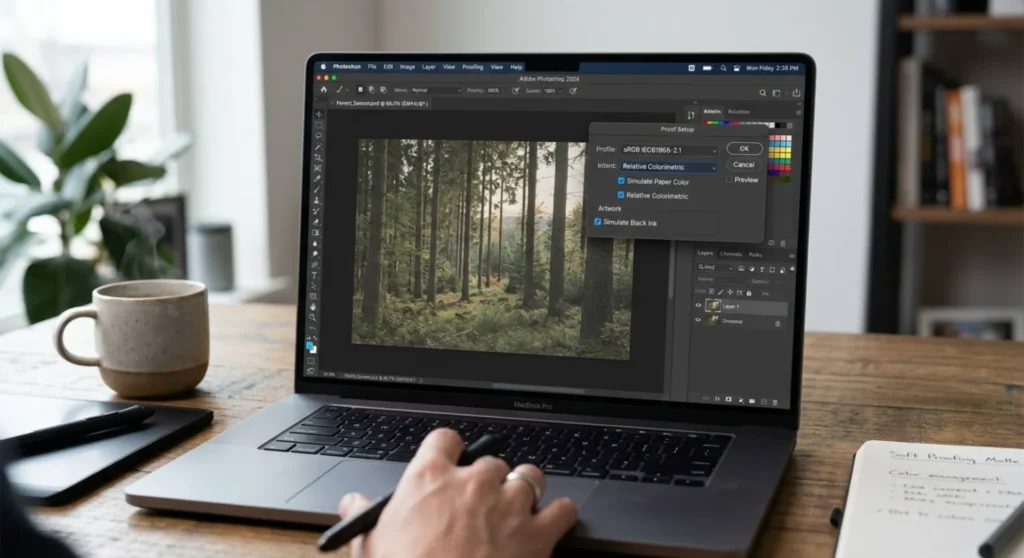
If any of your design work goes to press, this stage is where calibration value is actually realized. Soft proofing, simulating how your output will look when printed on a specific paper with a specific ink set, only works correctly on a calibrated display. On an uncalibrated monitor, soft proofing is a guess. On a calibrated monitor, it’s an accurate simulation.
Obtain the correct output device profile. Your print provider should supply ICC profiles for their specific press and paper combinations. Ask explicitly, any professional print house will have profiles for their RIP output. If they don’t, that’s a red flag about their color management workflow.
Common free sources for press profiles:
In Photoshop: View → Proof Setup → Custom → Device to Simulate: select your print output profile → Rendering Intent: Relative Colorimetric (for most print work) with Black Point Compensation enabled → enable Simulate Paper Color.
The display will shift, whites will appear slightly warm and shadows will lighten. This is correct. You are now seeing your design as it will appear on paper, rendered on your calibrated display. Any adjustments you make in this view will translate correctly to the printed output.
This stage is for print work only. Web and screen designers do not need output profiles, your sRGB ICC profile and correctly calibrated display mean that what you see is what sRGB-capable screens will show to your audience.
An ICC profile is a snapshot of your display’s behavior at one moment in time. Displays drift, backlights age, panel characteristics shift with thermal cycling, OSD settings can change accidentally. A profile that was accurate in January may be 3–5 ΔE off by July.
Recalibration schedule:
| Work Type | Recalibration Interval |
|---|---|
| Print production, professional photography | Every 2 – 4 weeks |
| Commercial design, art direction | Monthly |
| Web design, screen-centric work | Every 2 – 3 months |
| General creative work | Quarterly minimum |
Most colorimeter software supports scheduled reminders — set them. The first recalibration after initial profiling often reveals more drift than subsequent ones, because the panel was new and stabilizing when you first profiled it.
Always recalibrate after:
Q: My display looks noticeably different in Photoshop versus Chrome. Is the calibration wrong?
The calibration is probably fine, Chrome needs to be configured to use your ICC profile. Chrome is color-managed but defaults to the system ICC profile only when color management is explicitly enabled. Go to chrome://flags → search “color” → enable Force Color Profile → select sRGB or ICC profile from the dropdown depending on your workflow. After enabling, relaunch Chrome and the colors should match Photoshop’s sRGB-managed rendering closely.
Q: I calibrated my monitor and it now looks too yellow and dim compared to my colleague’s uncalibrated monitor. Whose is correct?
Yours is correct. An uncalibrated monitor running at factory defaults is typically too blue (5000–8000K color temperature depending on the “Warm/Cool” preset) and too bright (200–350 nits). It looks vivid and contrasty because those are the characteristics manufacturers optimize for retail display. D65 at 100 nits looks subdued by comparison, until you print the work and yours matches the print and your colleague’s doesn’t. This adjustment period is normal. Most designers recalibrate and accept that the first week feels wrong before the eye adapts.
Q: How do I know if my monitor is capable of accurate color work, or if calibration won’t help enough?
Measure its gamut coverage using your colorimeter’s monitor analysis mode, or use DisplayCAL (free, open-source) with your colorimeter to measure native gamut before profiling. If your monitor covers less than 90% of sRGB, calibration can correct color temperature and gamma but cannot expand the gamut, colors that fall outside your panel’s native gamut will be wrong regardless of the ICC profile. For print-critical work, 97%+ sRGB coverage is the minimum. For wide-gamut photography or video, you need a panel covering at least 90% of the relevant color space (DCI-P3 or AdobeRGB depending on workflow).
Q: Can I calibrate a laptop screen for professional design work, or do I need an external monitor?
A laptop screen can be calibrated and used for professional work, but with two important caveats. First, laptop panels vary enormously in quality, an average consumer laptop panel covers 60–75% sRGB and a calibrated version of it is still working within those limits. A professional-grade laptop (Dell XPS OLED, MacBook Pro with Liquid Retina XDR, ASUS ProArt StudioBook) has the gamut coverage to support accurate color work. Second, laptop panels are more sensitive to viewing angle than external monitors, calibration is accurate at the exact position you measured, and color shifts noticeably as you change viewing angle. Keep a consistent seating position when doing color-critical work.

Derek V. Mackown is a veteran IT Technician and Display Hardware Specialist with over a decade of hands-on experience troubleshooting complex software-hardware interface glitches. He specializes in Windows OS display architecture, driver calibration, and panel diagnostics. Driven by a passion for pixel-perfect performance, he writes highly analytical, step-by-step guides to help everyday users achieve absolute display clarity at AurumScreen.com.